How each project was made
-
Project Overview
How each project was made Visual process of the Movie Poster The process of the T-shirt print design Step 1: I opened Adobe Illustrator, and I drew the shape of my T-shirt on the canvas using the pen tool. But you can also grab a PNG T-shirt from Adobe Stock. After that, I played around…
The Process of this movie poster
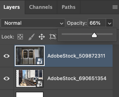
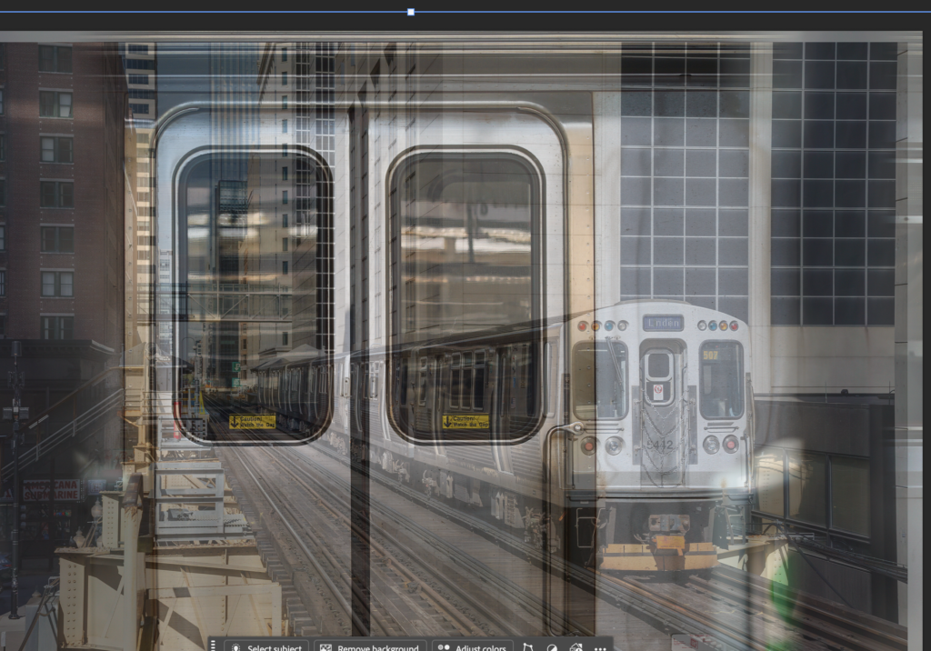
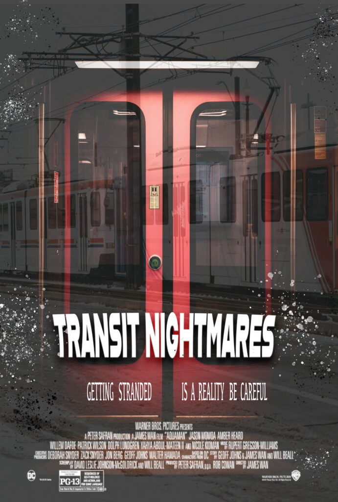
I made this project using adobe using adobe photo shop first i opened a file in Adobe Photoshop, and then I grabbed two photos from Adobe Stock, and I used layers and opacity to make it come together
Visual process of the Movie Poster
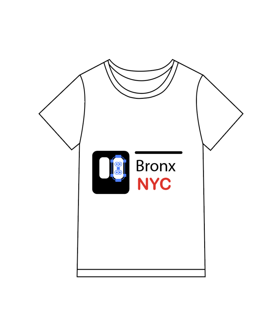
The process of the T-shirt print design
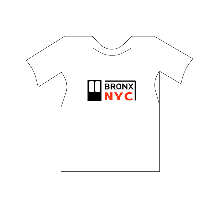
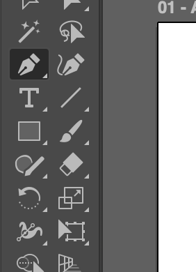
Step 1: I opened Adobe Illustrator, and I drew the shape of my T-shirt on the canvas using the pen tool. But you can also grab a PNG T-shirt from Adobe Stock. After that, I played around with text and elements to get my design
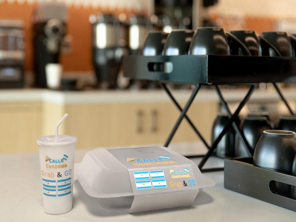
Food Packaging design Process
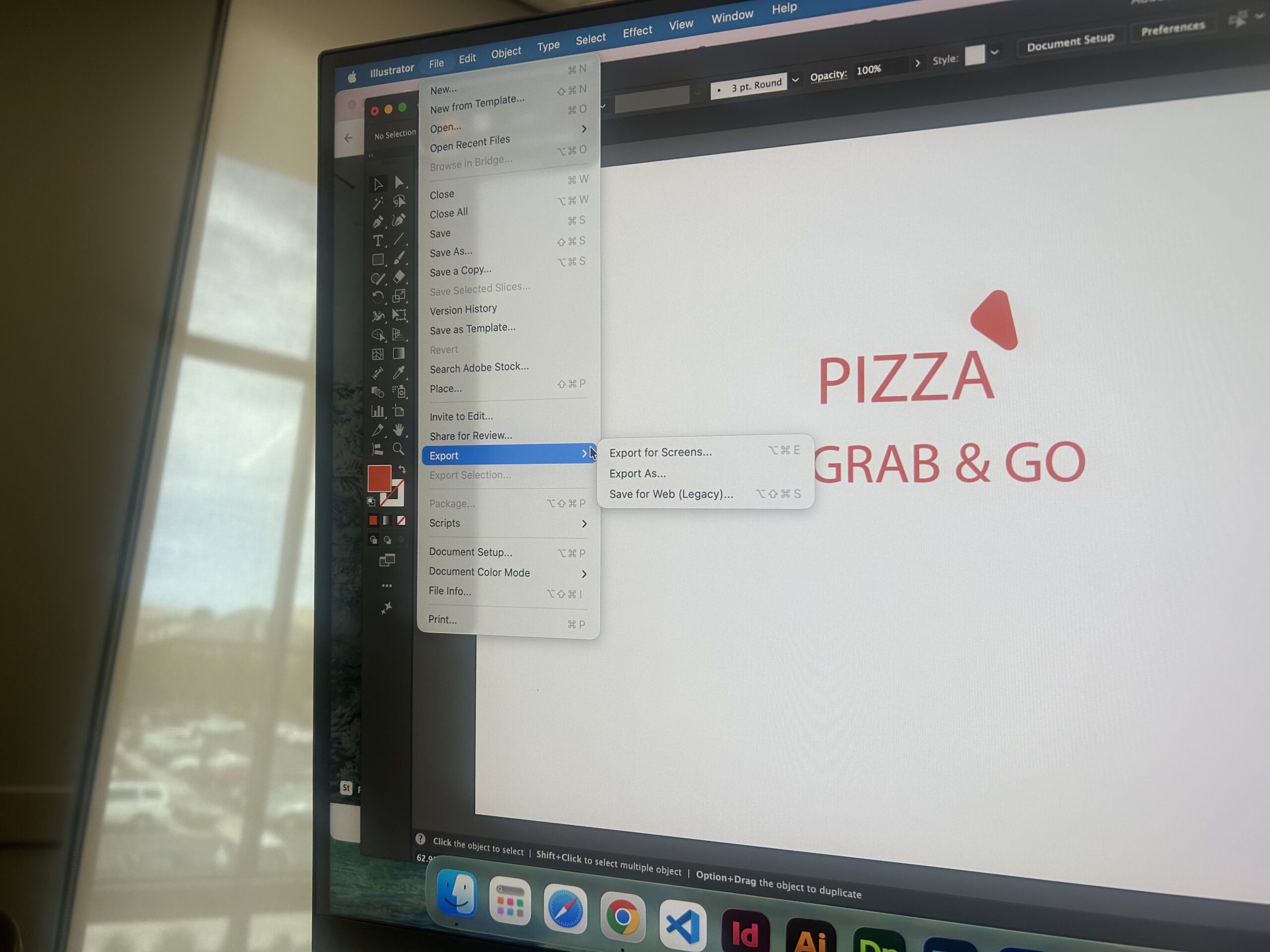
I made the logo & elements on adobe illustrator
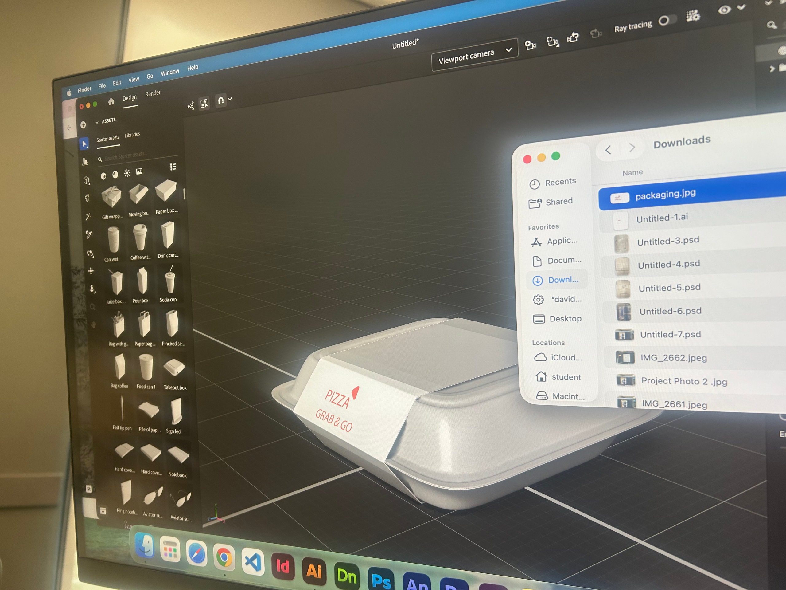
I exported it to downloads after I opened Adobe Dimensions. I picked my packaging, then clicked on the file with my logo on it and dragged it and it automatically placed on the packaging
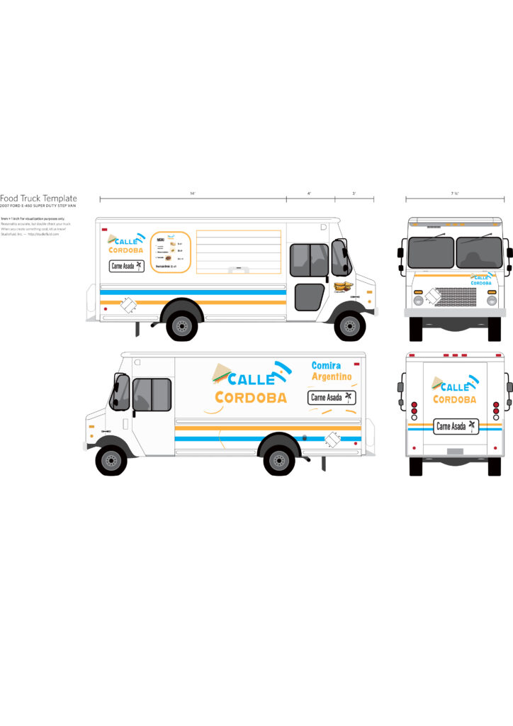
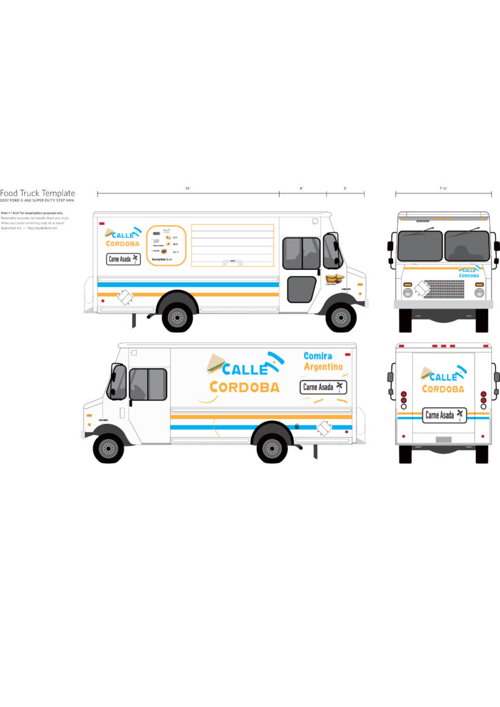
The process of my food truck logo design
How I got the idea for the name
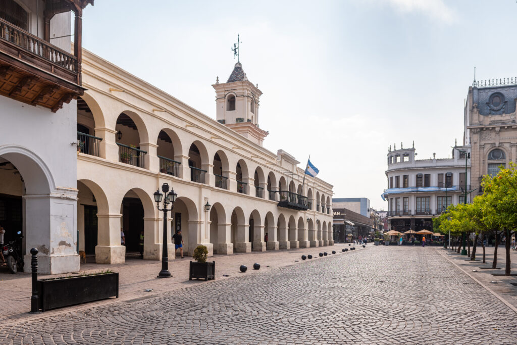
in Argentina there is a city city called Cordoba and Calle means street in Spanish that’s how i got the idea to name my food truck Calle Cordoba
START A WEBSITE
Explore what’s right for you
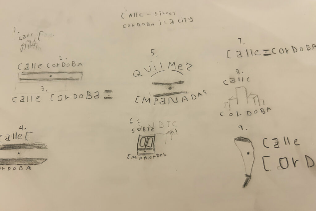
What I started with
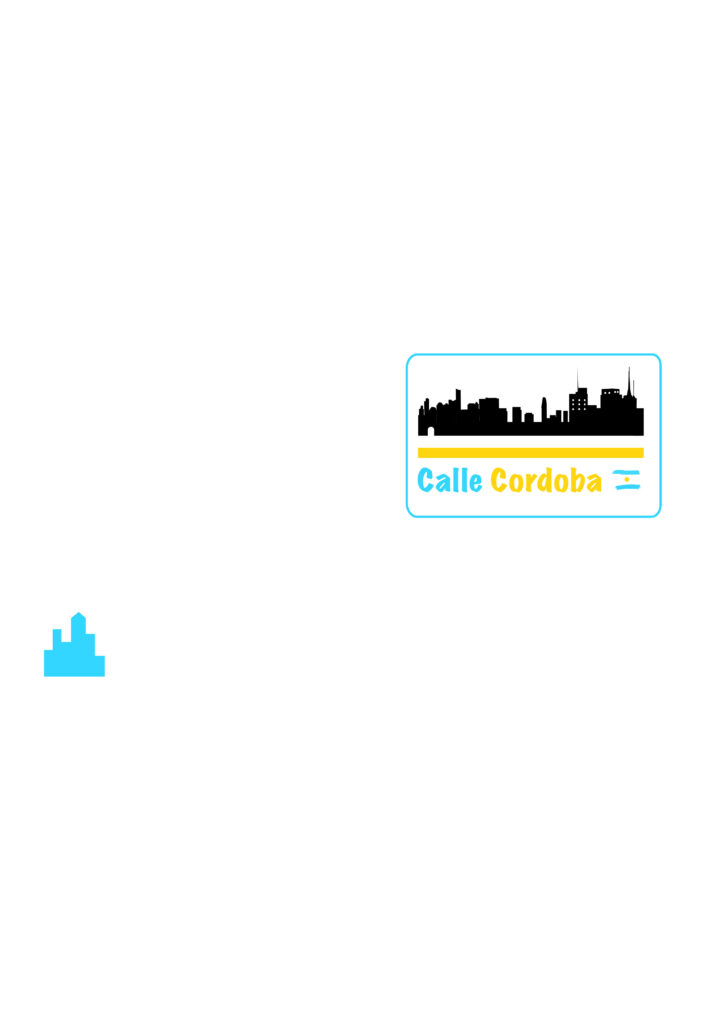
I started with this. I traced the city skyline of Cordoba, using its skyline for part of the logo
I had the class critique it. The critique pointed out that the skyline didn’t read as food.
Why I chose to use the sandwich for my logo
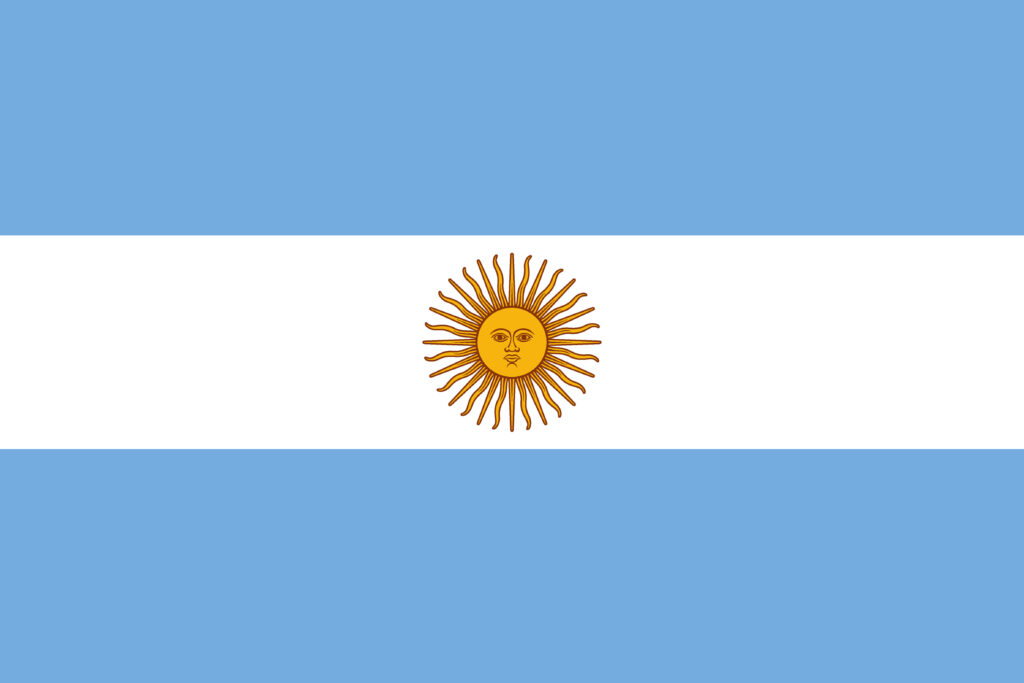
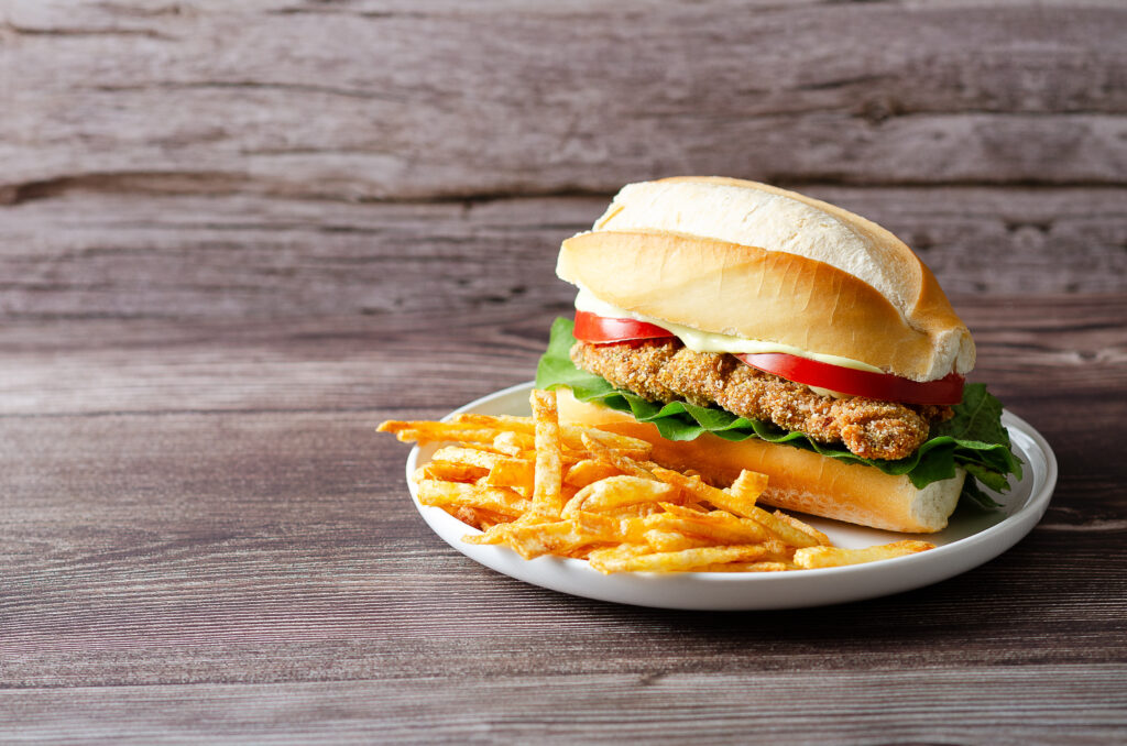
In Argentina, we call them Milanese sandwiches. A Milanese is flat beef or chicken that is breaded, and we put it in sandwiches, which is why I chose the sandwich to be in my logo. On the right side of my logo, I chose the Argentine flag
Challenges of this project
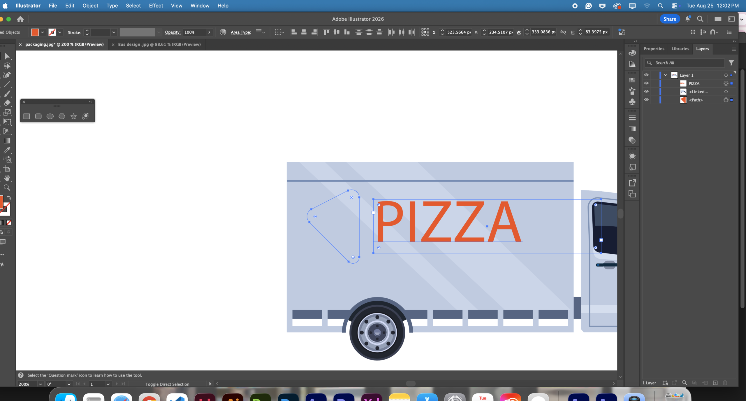
Changing the logo was one of my challenges. I had to change the text and play around with it. I also removed the skyline until I got the text and color right.
Challenges of this project PT 2
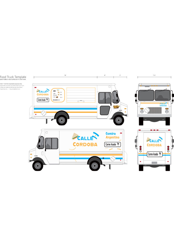
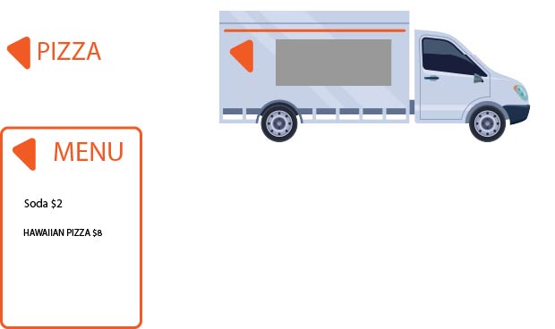
The food truck wrap was another challenge I faced when making this project. I had to learn how to use layers in Adobe Illustrator
What I have learned from this Project
I learned that keeping your brand consistent is a very valuable step when building a brand identity
If you make a food ordering app, it’s important to keep the brand consistent
across the menu and any products related to the brand
If I make a logo, for example, if I make a logo with specific colors, I have to Make-sure products and sites of your company
keep its colors and stay consistent so clients & employers can identify your brand
Example of Brand consistency
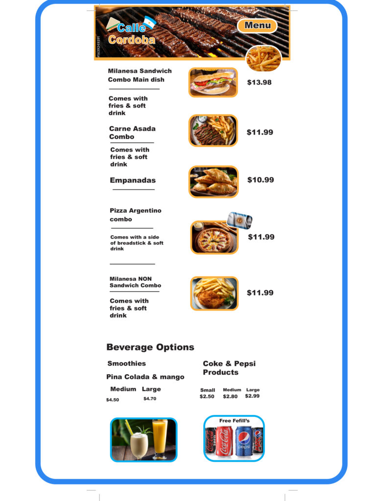
The process of my menu design
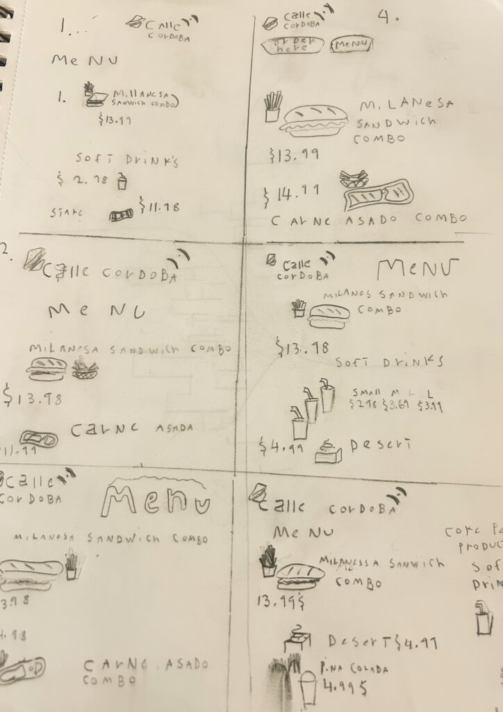
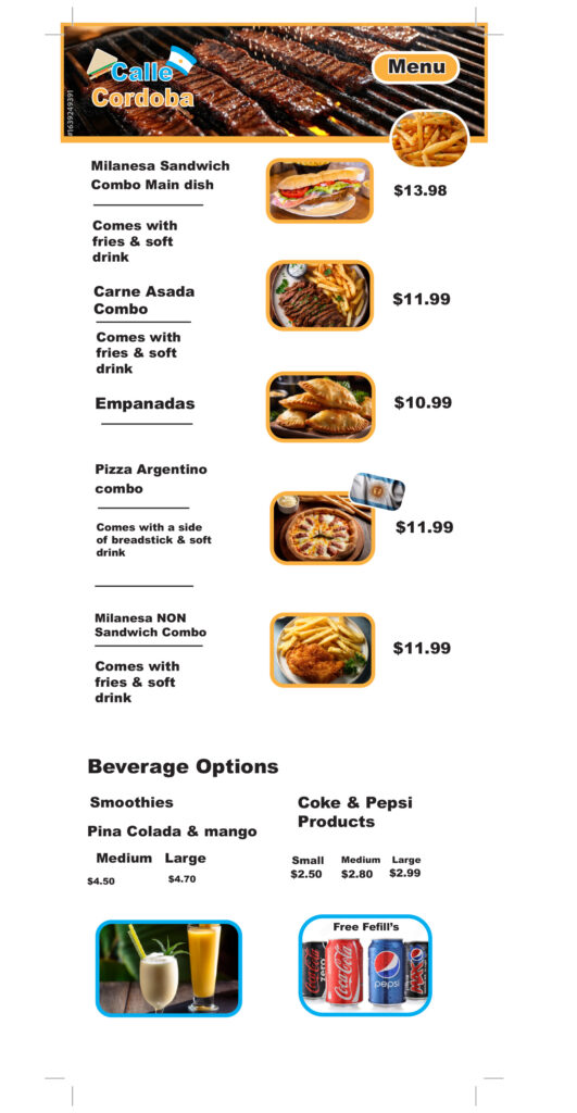
First, I did do sketches, deciding what the menu should look like. The food does contain AI-generated content. Sodas are PNG files
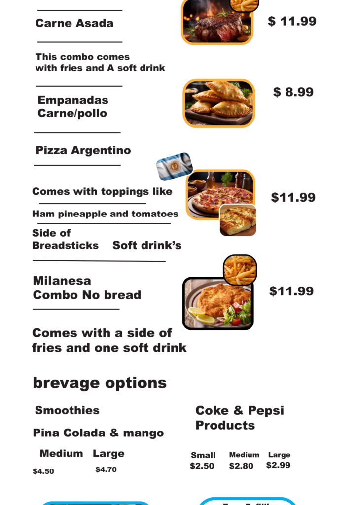
After the critique was organized, the text and the following results were obtained.
The Photo on the left side is the Menu design before it was critiqued; the one on the right side is the Menu design after it was critiqued
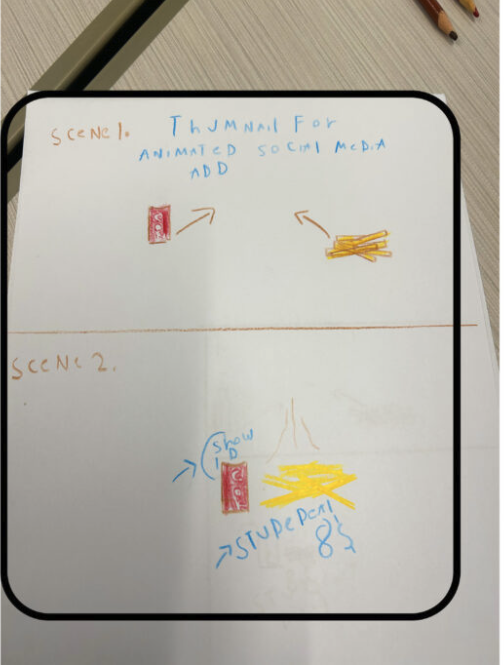
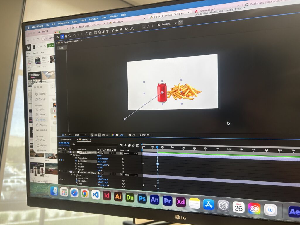
how i made my food truck social media ad
Step 1. I moved forward with the project and had it critiqued. After the critique, I sketched the movements and placement of the food and labels. I used software called Adobe After Effects to animate the food